I am extremely lucky to live only 30 minutes away from Australia Zoo, one of Australias most iconic tourist destinations. I have a yearly pass and am a regular visitor. I haven’t quite got the confidence to actually sit and sketch the animals but I am working up to it soon I think 🙂 What I am doing at the moment is taking about a million photos of the animals. I click away all day and then when I get home you can guarantee that only about 10% are actually any good haha. I think I need more lessons with my camera.
Anyway, this is working for me at the moment so I will continue with it. I don’t think you can have too many reference images, it’s all just a matter of keeping a good filing system on your computer. I have just installed adobe bridge so I am keen to try and figure out how to use it as I have heard it is great for this purpose.

I like to take photos of the animal in whole but I will then zoom up and take photos of individual elements such as the eye, feet, mouth etc. It is also a good idea to get plenty of photos of the animal in various stages of movement, I guess this is where most artists start sketching to try and capture that feeling but you can still get it with photos, or even better yet, take a bit of video of the animal in motion as well, if you really want to get the feel of what you are painting then it’s a great idea and great practice to set yourself up in front of your computer at home and try and do some sketches of the animal you have filmed. It really helps to get the feel of that animal before you start on your masterpiece 🙂
 When I am taking my photos I always try and look for good composition, I know that you can always crop etc on the computer but it definitely makes it a whole lot easier if you have an idea of composition whilst out on site.
I did a one-day photography course earlier this year with Chris Bray Photography at Australia Zoo and it taught me the basics of my Nikon DSLR camera. It was well worth the money as I have had the camera for 5 years and was only using it on automatic, now I know enough of the basics to see me taking great photos for my artwork reference. Hey, I’m never gonna win any awards but I can still get some great photos to work with.
I pretty much stay in Aperture mode (A) on my wheel. I find that I like most of my shots to have a short depth of field, which means only the subject I’m trying to shoot will be in focus. Everything else behind and in front will be blurry. My go to number on this is 5.6. The only other thing I use a lot is the Exposure Compensate Wheel. This is brilliant for adjusting the lighting. Because I am always wandering around the Zoo, the lighting varies a lot. Some animal enclosures are in the sun and of course, some are in the shadows or inside, so this little dial is a godsend to quickly adjust the exposure.
Its pretty much as simple as holding your finger down on the +/- button and turning the dial. You will see a scale on your screen that will go up and down depending on which direction you turn your dial. When the scale goes to the + side you will get lighter photos and when it goes to the – side you will get darker photos. Just keep checking your viewfinder after each shot until you are happy with the lighting. It’s quick adjustments like this that are crucial to taking good wildlife photos as the animals always seem to be camera shy so speed is necessary to getting a good shot.
Once I am back home and have some time, I will go over the photos I have taken that day and sort out the junk (blurry etc.) from the promising. I then import them into Adobe Lightroom and sort out my favorites by giving them a star rating. I find this is the best way to keep my photos organized. 5 stars are my images that I want to make a painting from so they are the ones that I set to work adjusting the colours, tones etc and working out composition.
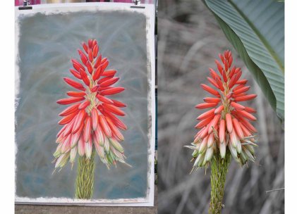
To work out the composition of a planned piece, I first look at my photo and decide what size I think will work best for it, tall and skinny, wide, square. Usually, the layout will jump out at me when I’m looking at the photo, this is partly due to my composition ideas I had while taking the photo, this is where I said it helps a lot to pre-think it during the picture taking process.
I don’t usually draw things small, the bigger the better I reckon haha. My biggest problem was finding the paper large enough to work on but I have just solved this problem with my latest order of a 1.2mtr wide roll of pastel paper and 1mtr wide sheets of Arches Watercolour paper, so now I am not restricted in any way.
One last tool I use before I am satisfied with my reference image and before I transfer it onto my drawing surface and that is my photoshop overlays of Composition Guides. I have 3 of these which are:
Rule of Thirds – Probably the simplest of all composition guides and if you only use just one then this is. The most important elements of your composition should be placed along the left or right vertical thirds and/or the top and bottom horizontal thirds. In addition, the four intersections of these lines are called the “power points.” This is where a subject should be placed to give it emphasis, and it is here where the eye is automatically drawn.
Golden Mean – The golden ratio appears in some patterns in nature, a spiral shell for example. It has been used by the greatest painters to proportion their works and keep it aesthetically pleasing.
 Diamond Guide – Probably the most complex but still can be used in most situations. This one is useful for creating strong lead lines to the focal point. Imagine where you might place a face, where the eyes will look.
I hope this has given you an insight into how I compose my work and also given you some ideas for your own interesting compositions.
Now don’t say I never give you guys anything, here is my Photoshop File of all 3 different composition guides for you to use on your own layouts. Just place this file over your picture in photoshop and hide the guides you don’t want to use. Simple 🙂
The only way I could figure out how to share this photoshop file with everyone was as a dropbox link, I hope this works for everyone. If not comment below with your email address and I will send the file directly to you.
Happy Painting 🙂
Kerri xx


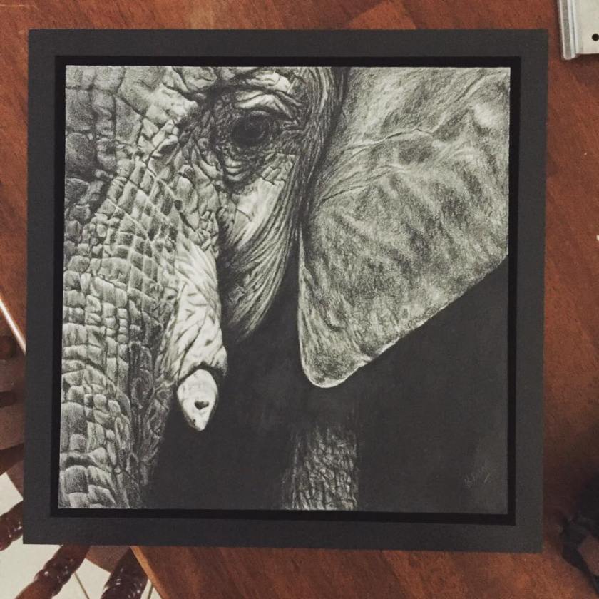 So this is my elephant before I poured the resin on and if you check out


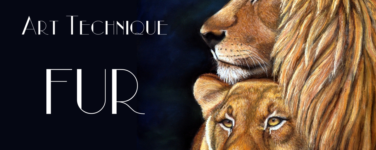
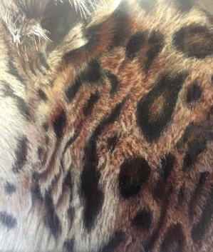 ut the basic principals apply to all. To start with you need to figure out your Light, Medium and Darks.
 eopard Drawing I used basically these range of colours in both pastel pencils and soft pastels. I always use about 20 different colours but these are the basic Light , Medium and Dark range.
 For thick fur you need to look at the shapes within the fur, try not to look at it as heaps of fine lines, you really need to try and section it into clumps and work on a small area at a time. For short hair I find that it works best to build up the colours with short strokes but always make sure that these strokes are going in the direction of the fur.
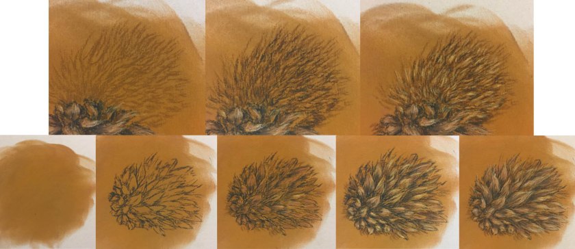
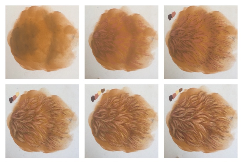 I will try and explain better in the steps as shown above.